New Feature for Digital Advisor - Adding a Spouse or Partner into the platform
One of the most important new features for Digital Advisor was the ability to add a spouse or partner’s financial details into the platform. By providing this information, users could get a more accurate financial picture for their household.
I was the Senior UX Writer on this project and helped guide users through the process.
Our content was informed by user research, which uncovered pain points and the needs of our users. We conducted rounds of user interviews that helped clarify our content strategy.
In collaboration with our team of designers, we built an experience that was simple and intuitive.
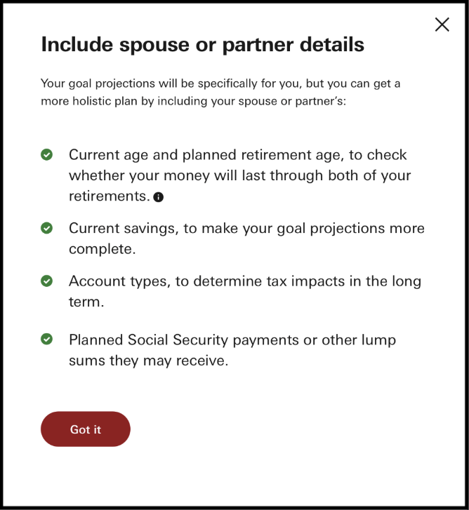
Below are examples from the enrollment flow in Digital Advisor. It started with a page that introduced the new feature and explained how it would impact the user. From this page, we included a link to a modal that provided information on which details we would need about your spouse or partner.

When enrolling in an investment platform, you need a lot of information. After doing significant testing, we discovered that users wanted a list of everything they would have to collect before starting the enrollment process, including current savings, and account types. This modal set out all the details that are needed.
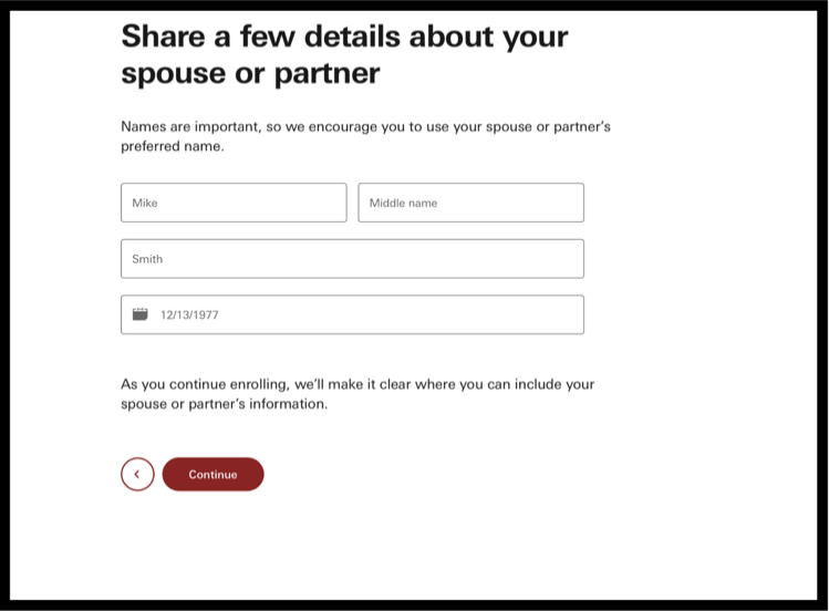
Next we needed to ask some basic details about the users spouse or partner. As a content team, we referenced Vanguard’s voice and tone guidelines. We wanted to make the copy personal by using language like “Names are important…” This gives a feeling that Vanguard cares about its users and knows the importance of an individual’s name.
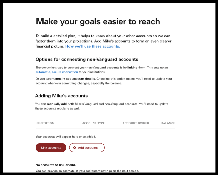
To make enrolling simple, we gave users the option of automatically or manually adding their accounts.
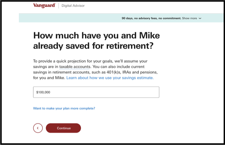
We also made it clear where users would be putting joint information and where they would be putting in information for each individual. Through user testing and collaboration with our designers, we were able to find a clear layout to display the information. To help users throughout the process, we dynamically inserted the spouse or partner’s name in the relevant places. (In this instance, we used the name “Mike” as an example.)
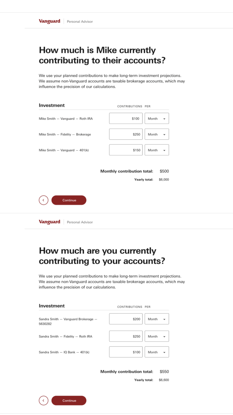
Here is an example of a page where joint information was required.
This is just a selection of the elements in the enrollment process. By creating a seamless and simple experience, we were able to lead users through the process of adding a spouse or partner into the Digital Advisor platform. This was done through carefully crafted and researched UX content.
This critical new feature for Vanguard is intended to increase the user base and help individuals get a better financial picture.
Everything in the user experience supported Vanguard’s mission of giving investors “the best chance for investment success.”